Thick + DOH! by Studio adot
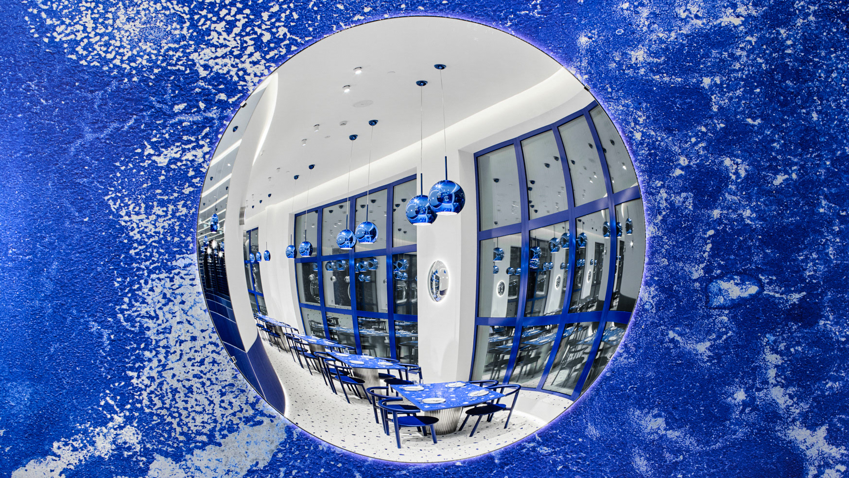
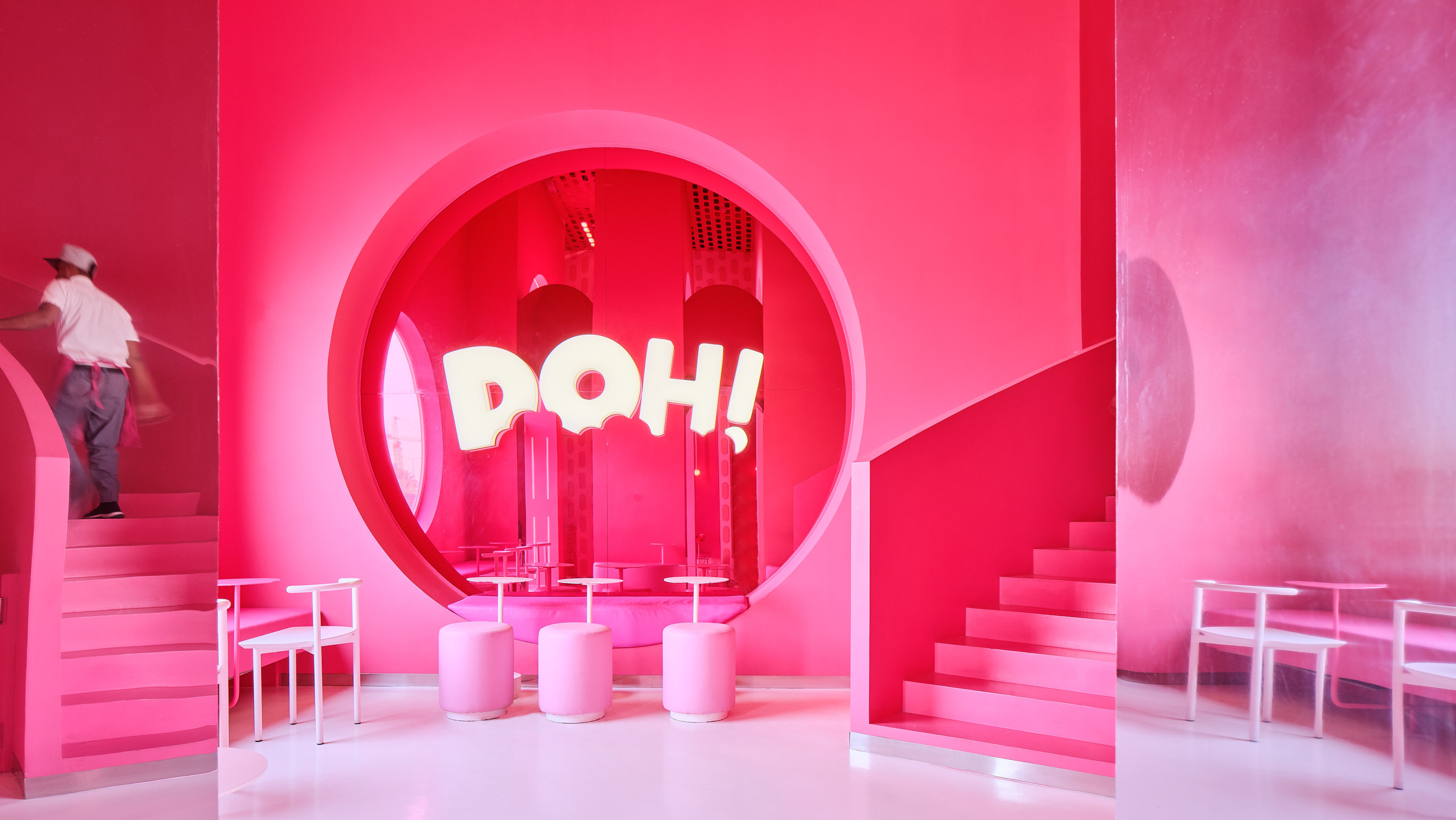
*This project groups two local brands that are known for being bold, colorful, and playful. The challenge was mainly presented in channeling their vision while maintaining a clean and functional layout. As the shop is located in a mall and visible from multiple vantage points, we decided to keep it mostly open but graphically divided to create more visual interest. Three large circle cutouts act as the main divider of the dining area, and create intrigue from the side view. The interior and exterior fluted walls are entirely clad with chrome and pink chrome stickers, playfully tying in the interior with both brands' bold metallic packaging. Chrome elements are also present in the playful pendants by Pandul, as well as the exterior seating by Magis. Pops of blue highlight the Thick area with elegant yet playful chairs by Noom and custom couches in the same woolen fabric. *By Studio adot Photography by Mohammad Taqi
